서비스를 개발할 때 모달을 사용할 일이 매우 많다고 생각합니다.
자주 쓰이게 되는 만큼 대부분 디자인시스템을 구현할 때 모달 컴포넌트가 들어가게 됩니다.
어떻게 하면 이를 잘 만들 수 있을지에 대해 알아보고자 합니다. (shadcn-ui를 참고했습니다.)
프론트엔드에서 컴포넌트를 잘 만든다는건 어떤걸 의미하는걸까요?
개발자와 서비스 이용자 모두 컴포넌트를 사용할 때 불편함 없이 사용하는걸 의미한다고 생각합니다.
한마디로 ux와dx를 잘 충족시켜야 컴포넌트를 잘 만들었다고 할 수 있을거 같습니다.
그렇다면, 모달 컴포넌트에서 ux와dx를 어떻게 잘 충족시킬 수 있을까요?
- 컴포넌트 재사용성이 높고 유연한 구조
- 애니메이션 잘 다루기
- 사용자 접근성 지키기
본 글에서는 우선 첫 번째로, 컴포넌트 재사용성이 높고 유연한 구조로 개발하는 방법에 대해 알아보고자 합니다.
컴파운드 컴포넌트로 만들기
Alert 다이얼로그 모달의 특성상 ui구조가 항상 똑같이 배치되는건 아닙니다.
아래와 같이 버튼의 위치, 텍스트 스타일, 버튼의 개수가 다를수 있습니다.
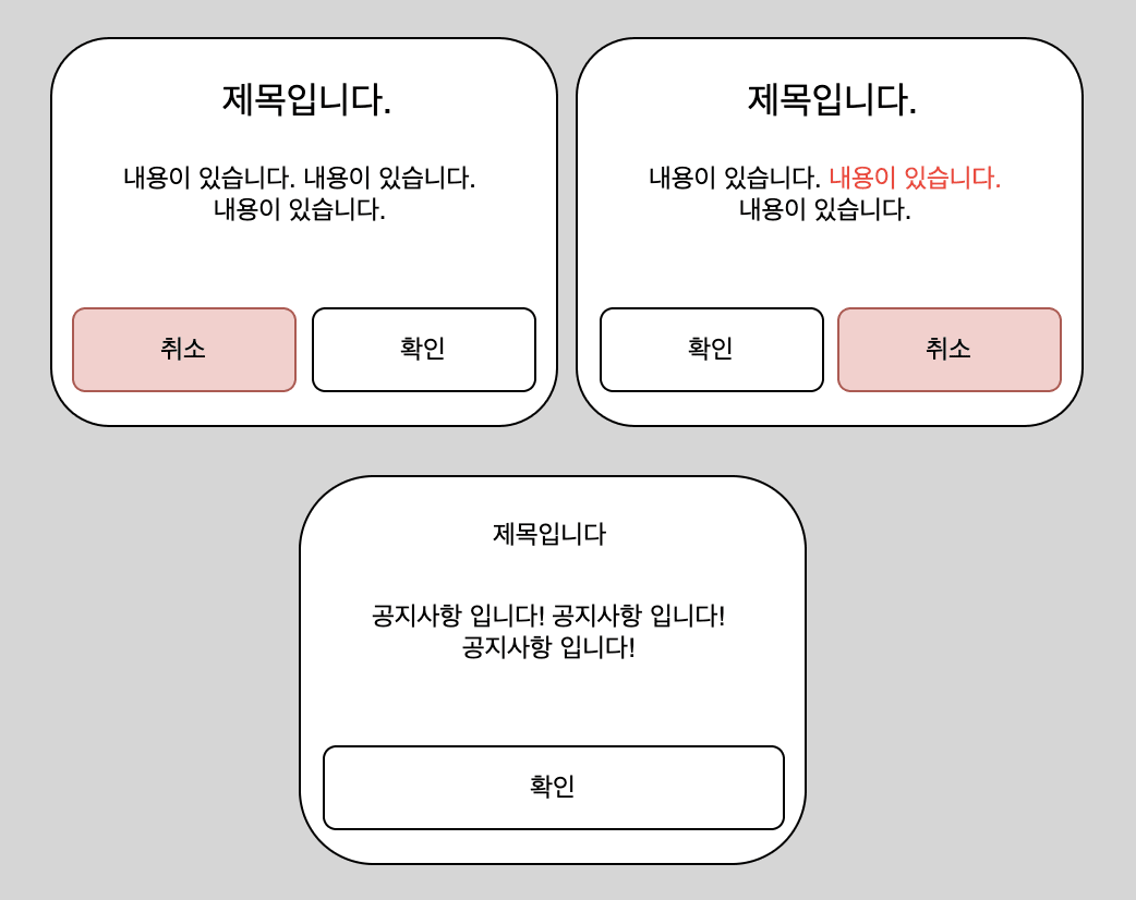
컴파운드 컴포넌트로 만들게 된다면, 여러 ui에 유연하게 대응할 수 있기 때문에 컴파운드 구조로 만들어보겠습니다.
대략적인 구조 잡기
컴파운드 컴포넌트 패턴을 활용하여 다음과 같은 코드 구조로 사용할 수 있게 만들어보겠습니다.
// AlertDialog.tsx
import React from 'react';

/* -------------------------------------------------------------------------------------------------
 * AlertDialog
 * -----------------------------------------------------------------------------------------------*/
const AlertDialog = ({children}: any) => {
  return <>{children}</>;
};

/* -------------------------------------------------------------------------------------------------
 * AlertDialogTrigger
 * -----------------------------------------------------------------------------------------------*/
const Trigger = ({children}: any) => {
  return <>{children}</>;
};
/* -------------------------------------------------------------------------------------------------
 * AlertDialogOverlay
 * -----------------------------------------------------------------------------------------------*/
const Overlay = () => {
  return <div>Overlay</div>;
};
/* -------------------------------------------------------------------------------------------------
 * AlertDialogContent
 * -----------------------------------------------------------------------------------------------*/
const Content = ({ children }: any) => {
  return <div>{children}</div>;
};
/* -------------------------------------------------------------------------------------------------
 * AlertDialogHeader
 * -----------------------------------------------------------------------------------------------*/
const Header = ({ className, ...props }: React.HTMLAttributes<HTMLDivElement>) => (
  <div {...props} />
);

/* -------------------------------------------------------------------------------------------------
 * AlertDialogFooter
 * -----------------------------------------------------------------------------------------------*/
const Footer = ({ className, ...props }: React.HTMLAttributes<HTMLDivElement>) => (
  <div {...props} />
);
/* -------------------------------------------------------------------------------------------------
 * AlertDialogTitle
 * -----------------------------------------------------------------------------------------------*/
const Title = ({ children }: any) => {
  return <div>{children}</div>;
};
/* -------------------------------------------------------------------------------------------------
 * AlertDialogDescription
 * -----------------------------------------------------------------------------------------------*/
const Description = ({ children }: any) => {
  return <div>{children}</div>;
};
/* -------------------------------------------------------------------------------------------------
 * AlertDialogAction
 * -----------------------------------------------------------------------------------------------*/
const Action = ({ children }: any) => {
  return <div>{children}</div>;
};
/* -------------------------------------------------------------------------------------------------
 * AlertDialogCancel
 * -----------------------------------------------------------------------------------------------*/
const Cancel = ({ children }: any) => {
  return <div>{children}</div>;
};

export default Object.assign(AlertDialog, {
  Trigger,
  Content,
  Header,
  Footer,
  Title,
  Description,
  Action,
  Cancel,
});
// AlertDialog.tsx
import React from 'react';
/* -------------------------------------------------------------------------------------------------
* AlertDialog
* -----------------------------------------------------------------------------------------------*/
const AlertDialog = ({children}: any) => {
return <>{children}</>;
};
/* -------------------------------------------------------------------------------------------------
* AlertDialogTrigger
* -----------------------------------------------------------------------------------------------*/
const Trigger = ({children}: any) => {
return <>{children}</>;
};
/* -------------------------------------------------------------------------------------------------
* AlertDialogOverlay
* -----------------------------------------------------------------------------------------------*/
const Overlay = () => {
return <div>Overlay</div>;
};
/* -------------------------------------------------------------------------------------------------
* AlertDialogContent
* -----------------------------------------------------------------------------------------------*/
const Content = ({ children }: any) => {
return <div>{children}</div>;
};
/* -------------------------------------------------------------------------------------------------
* AlertDialogHeader
* -----------------------------------------------------------------------------------------------*/
const Header = ({ className, ...props }: React.HTMLAttributes<HTMLDivElement>) => (
<div {...props} />
);
/* -------------------------------------------------------------------------------------------------
* AlertDialogFooter
* -----------------------------------------------------------------------------------------------*/
const Footer = ({ className, ...props }: React.HTMLAttributes<HTMLDivElement>) => (
<div {...props} />
);
/* -------------------------------------------------------------------------------------------------
* AlertDialogTitle
* -----------------------------------------------------------------------------------------------*/
const Title = ({ children }: any) => {
return <div>{children}</div>;
};
/* -------------------------------------------------------------------------------------------------
* AlertDialogDescription
* -----------------------------------------------------------------------------------------------*/
const Description = ({ children }: any) => {
return <div>{children}</div>;
};
/* -------------------------------------------------------------------------------------------------
* AlertDialogAction
* -----------------------------------------------------------------------------------------------*/
const Action = ({ children }: any) => {
return <div>{children}</div>;
};
/* -------------------------------------------------------------------------------------------------
* AlertDialogCancel
* -----------------------------------------------------------------------------------------------*/
const Cancel = ({ children }: any) => {
return <div>{children}</div>;
};
export default Object.assign(AlertDialog, {
Trigger,
Content,
Header,
Footer,
Title,
Description,
Action,
Cancel,
});위와 같이 구조를 잡아주고 코드베이스에서 사용할 때는 아래와 같은 형태로 사용할 수 있도록 구현을 할 것입니다.
const AlertConfirmModal = () => {
  return (
    <AlertDialog>
      <AlertDialog.Trigger asChild>
        <Button>열기</Button>
      </AlertDialog.Trigger>
      <AlertDialog.Content>
        <AlertDialog.Header>
          <AlertDialog.Title>제목입니다</AlertDialog.Title>
          <AlertDialog.Description>내용입니다~~~</AlertDialog.Description>
        </AlertDialog.Header>
        <AlertDialog.Footer>
          <AlertDialog.Cancel>취소</AlertDialog.Cancel>
          <AlertDialog.Action>확인</AlertDialog.Action>
        </AlertDialog.Footer>
      </AlertDialog.Content>
    </AlertDialog>
  );
}
const AlertConfirmModal = () => {
return (
<AlertDialog>
<AlertDialog.Trigger asChild>
<Button>열기</Button>
</AlertDialog.Trigger>
<AlertDialog.Content>
<AlertDialog.Header>
<AlertDialog.Title>제목입니다</AlertDialog.Title>
<AlertDialog.Description>내용입니다~~~</AlertDialog.Description>
</AlertDialog.Header>
<AlertDialog.Footer>
<AlertDialog.Cancel>취소</AlertDialog.Cancel>
<AlertDialog.Action>확인</AlertDialog.Action>
</AlertDialog.Footer>
</AlertDialog.Content>
</AlertDialog>
);
}구현하기
이제 각 컴포넌트를 세부적으로 구현을 해보겠습니다.
1. Trigger 구현
Trigger 컴포넌트의 역할 : Trigger컴포넌트를 클릭할 경우 Content컴포넌트를 노출합니다.
구현할 기능들은 아래와 같습니다.
- asChild props가
true일 경우 :Trigger컴포넌트는 children props에 정의된 요소로 렌더링이 됩니다. - asChild props가
false일 경우 :Trigger컴포넌트는button으로 렌더링이 되고 그 아래의 children은Trigger컴포넌트의 하위로 들어가게 됩니다. - 사용자가 Trigger 버튼을 눌렀을 경우 모달 toggle을 시키기 위해 미리 정의를 해둔 이벤트를 실행 시킵니다. 만약
Trigger컴포넌트에 onClick 이벤트를 정의했다면, 해당 onClick이벤트도 같이 실행시킵니다. - Trigger컴포넌트에 정의된 props를 화면에 렌더링될 요소의 props에 그대로 할당합니다.
// util.ts
function composeEventHandlers<E>(
  originalEventHandler?: (event: E) => void,
  ourEventHandler?: (event: E) => void,
) {
  return (event: E) => {
    originalEventHandler?.(event);
    ourEventHandler?.(event);
  };
}


/* -------------------------------------------------------------------------------------------------
 * AlertDialogTrigger
 * -----------------------------------------------------------------------------------------------*/
const Trigger = React.forwardRef<
  HTMLButtonElement,
  React.ButtonHTMLAttributes<HTMLButtonElement> & { asChild?: boolean }
>((props, ref) => {
  const { children, asChild, ...others } = props;
  const onToggle = () => console.log("토글!!")
  if (!asChild)
    return (
      <button ref={ref} {...others} onClick={composeEventHandlers(others.onClick, onToggle)}>
        {children}
      </button>
    );
  if (!React.isValidElement(children)) return null;

  function handler(childHanlder?: (e: React.MouseEvent<HTMLButtonElement>) => void) {
    return (e: React.MouseEvent<HTMLButtonElement>) => {
      childHanlder?.(e);
      others.onClick?.(e);
    };
  }


  const Compo = React.cloneElement(children, {
	...{ ...others, ...children?.props },
    type: 'button',
    ref: ref,
    onClick: composeEventHandlers(handler(children?.props?.onClick), onToggle),
  });
  return <>{Compo}</>;
});
Trigger.displayName = 'Trigger';
// util.ts
function composeEventHandlers<E>(
originalEventHandler?: (event: E) => void,
ourEventHandler?: (event: E) => void,
) {
return (event: E) => {
originalEventHandler?.(event);
ourEventHandler?.(event);
};
}
/* -------------------------------------------------------------------------------------------------
* AlertDialogTrigger
* -----------------------------------------------------------------------------------------------*/
const Trigger = React.forwardRef<
HTMLButtonElement,
React.ButtonHTMLAttributes<HTMLButtonElement> & { asChild?: boolean }
>((props, ref) => {
const { children, asChild, ...others } = props;
const onToggle = () => console.log("토글!!")
if (!asChild)
return (
<button ref={ref} {...others} onClick={composeEventHandlers(others.onClick, onToggle)}>
{children}
</button>
);
if (!React.isValidElement(children)) return null;
function handler(childHanlder?: (e: React.MouseEvent<HTMLButtonElement>) => void) {
return (e: React.MouseEvent<HTMLButtonElement>) => {
childHanlder?.(e);
others.onClick?.(e);
};
}
const Compo = React.cloneElement(children, {
...{ ...others, ...children?.props },
type: 'button',
ref: ref,
onClick: composeEventHandlers(handler(children?.props?.onClick), onToggle),
});
return <>{Compo}</>;
});
Trigger.displayName = 'Trigger';핵심적으로 cloneElement와 composeEventHandlers라는 함수를 이용하여 구현을 했습니다.
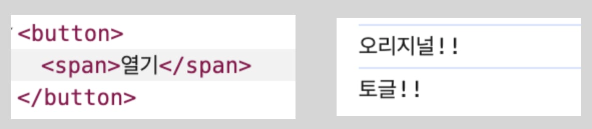
Trigger컴포넌트를 사용해서 DOM에 렌더링 되는 결과와 클릭시 console에 어떻게 찍히는지 확인을 해보겠습니다.
//1번
<AlertDialog>
<AlertDialog.Trigger onClick={() => console.log('오리지널!!')}>
<span>열기</span>
</AlertDialog.Trigger>
</AlertDialog>
//2번
<AlertDialog>
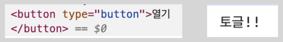
<AlertDialog.Trigger asChild>
<button>열기</button>
</AlertDialog.Trigger>
</AlertDialog>
//1번
<AlertDialog>
	<AlertDialog.Trigger onClick={() => console.log('오리지널!!')}>
          <span>열기</span>
	</AlertDialog.Trigger>
</AlertDialog>

//2번

<AlertDialog>
	<AlertDialog.Trigger asChild>
          <button>열기</button>
	</AlertDialog.Trigger>
</AlertDialog>
1번 결과
Trigger컴포넌트의 onClick 이벤트에 넘긴 함수와 Trigger컴포넌트 내부에 Content컴포넌트를 토글시키기 위해 존재하는 함수가 전부 정상적으로 동작을 합니다.
2번 결과
asChild props가 존재하므로 Trigger컴포넌트가 하위의 button컴포넌트로 대체되어서 렌더링이 되고 있습니다.
의도한대로 동작하는 것을 확인했으니 위에서 구현한 콘솔만 찍고 있는 onToggle함수를 아래 Content 컴포넌트의 렌더링 여부를 결정할 수 있도록 구현을 해주겠습니다.
<AlertDialog>
 <AlertDialog.Trigger asChild>
   <Button>열기</Button>
 </AlertDialog.Trigger>
 <AlertDialog.Content> // Content 컴포넌트
   content
 </AlertDialog.Content>
</AlertDialog><AlertDialog>
<AlertDialog.Trigger asChild>
<Button>열기</Button>
</AlertDialog.Trigger>
<AlertDialog.Content> // Content 컴포넌트
content
</AlertDialog.Content>
</AlertDialog>Trigger버튼을 눌렀을 경우 Content컴포넌트가 나타나야 하는데 Content컴포넌트에서 어떻게 toggle 여부를 알 수 있을까요?
Context API를 사용해서 구현을 할 수 있습니다.
Trigger와 Content의 상위 컴포넌트인 AlertDialog에 Provider를 통해 값을 주입후 하위 컴포넌트끼리 값을 공유할 수 있도록 만들어주면 됩니다.
세가지 값을 context에 제공하겠습니다.
open: 모달이 화면에 보이는지 여부onOpenChange: 모달의open상태를 강제로 변경하기 위한 함수onOpenToggle:open의 상태를 toggle형태로 변경하기 위한 함수
import { createContext, useContext } from 'react';

export type AlertDialogContextValue = {
  open: boolean;
  onOpenChange: (open: boolean) => void;
  onOpenToggle: () => void;
};

export const AlertDialogContext = createContext<AlertDialogContextValue | null>(null);
AlertDialogContext.displayName = 'AlertDialogContext';

export const useAlertDialogContext = () => {
  const context = useContext(AlertDialogContext);

  if (context === null) {
    throw new Error('useAlertDialogContext must be used within a <AlertDialog />');
  }
  return context;
};
AlertDialog 컴포넌트에 Provider를 통해 값을 주입해줍니다.
AlertDialog의 props에 있는 onOpenChange의 경우엔 open의 상태가 변경될 때 마다 호출이 됩니다.
/* -------------------------------------------------------------------------------------------------
 * AlertDialog
 * -----------------------------------------------------------------------------------------------*/
interface DialogProps {
  children?: React.ReactNode;
  defaultOpen?: boolean;
  onOpenChange?: (open: boolean) => void;
}

const AlertDialog = (props: DialogProps) => {
  const { children, defaultOpen = false, onOpenChange } = props;

  const [open, setOpen] = useState(defaultOpen);

  useEffect(() => {
    onOpenChange?.(open);
  }, [onOpenChange, open]);

  const alertDialogContextValue = React.useMemo(
    () => ({
      open,
      onOpenChange: (open: boolean) => setOpen(open),
      onOpenToggle: () => setOpen((prev) => !prev),
    }),
    [open],
  );
  return (
    <AlertDialogContext.Provider value={alertDialogContextValue}>
      {children}
    </AlertDialogContext.Provider>
  );
};
/* -------------------------------------------------------------------------------------------------
* AlertDialog
* -----------------------------------------------------------------------------------------------*/
interface DialogProps {
children?: React.ReactNode;
defaultOpen?: boolean;
onOpenChange?: (open: boolean) => void;
}
const AlertDialog = (props: DialogProps) => {
const { children, defaultOpen = false, onOpenChange } = props;
const [open, setOpen] = useState(defaultOpen);
useEffect(() => {
onOpenChange?.(open);
}, [onOpenChange, open]);
const alertDialogContextValue = React.useMemo(
() => ({
open,
onOpenChange: (open: boolean) => setOpen(open),
onOpenToggle: () => setOpen((prev) => !prev),
}),
[open],
);
return (
<AlertDialogContext.Provider value={alertDialogContextValue}>
{children}
</AlertDialogContext.Provider>
);
};이전 Trigger 컴포넌트의 콘솔만 찍던 onToggle 함수를 onOpenToggle 함수로 변경을 해줍니다.
이제 Trigger컴포넌트를 클릭할 경우 AlertDialogContext의 open의 상태가 변경이 됩니다.
- const onToggle = () => console.log('토글!!');
+ const { onOpenToggle } = useAlertDialogContext();
- const onToggle = () => console.log('토글!!');
+ const { onOpenToggle } = useAlertDialogContext();변경된 open의 상태를 Content 컴포넌트에서 사용을 해주면 Trigger 컴포넌트의 역할은 끝입니다.
2. Content 구현
Content 컴포넌트의 역할 : AlertDialog를 리액트 컴포넌트 트리 바깥에서 렌더링 시켜서 보여줍니다.
구현할 핵심 내용
첫 번째
- Trigger 버튼을 눌렀을 때 변경되는
open의 상태에 따라 Content컴포넌트의 렌더링 여부 결정
두 번째
- react portal을 사용하여 body아래에 요소를 렌더링 시키는 Portal 컴포넌트와 dimed처리를 위한 Overlay컴포넌트를 조합하여 Content 컴포넌트 구현
왜 React Portal을 사용하는가?
일반적으로 리액트는 컴포넌트 트리 안에서 렌더링되지만, 포탈을 사용하면 DOM 트리의 다른 위치로 자식 컴포넌트를 렌더링할 수 있습니다.
AlertDialog 컴포넌트는 애플리케이션의 레이아웃과 상관 없이 dom의 정중앙에 위치를 시킬것이므로 Portal이 적절할 거 같습니다.
리액트 포탈을 사용할때의 장점입니다.
- 모달이나 툴팁과 같은 UI 요소를 애플리케이션의 루트 DOM 요소 외부에 렌더링할 때
- 스크롤링이나 z-index 등의 CSS 속성에 의해 영향을 받지 않고 원하는 위치에 UI를 렌더링할 때
각 컴포넌트를 구현해보겠습니다.
- Overlay 컴포넌트
dimed처리를 위한 요소입니다. 별다른 기능이 없습니다.
/* -------------------------------------------------------------------------------------------------
 * AlertDialogOverlay
 * -----------------------------------------------------------------------------------------------*/
const Overlay = (props: React.HTMLAttributes<HTMLDivElement>) => {
  const { className, ...others } = props;
  return <div {...others} className={`fixed inset-0 z-50 bg-black/40 ${className}`} />;
};
/* -------------------------------------------------------------------------------------------------
* AlertDialogOverlay
* -----------------------------------------------------------------------------------------------*/
const Overlay = (props: React.HTMLAttributes<HTMLDivElement>) => {
const { className, ...others } = props;
return <div {...others} className={`fixed inset-0 z-50 bg-black/40 ${className}`} />;
};- Portal 컴포넌트 코드
container props가 존재하지 않으면 body아래에 컴포넌트를 렌더링시킵니다.
/* -------------------------------------------------------------------------------------------------
 * AlertDialogPortal
 * -----------------------------------------------------------------------------------------------*/

interface PortalProps {
  container?: HTMLElement | null;
  children: React.ReactNode;
}
const Portal = (props: PortalProps) => {
  const { container = globalThis?.document?.body, children } = props;
  return container ? createPortal(children, container) : null;
};
/* -------------------------------------------------------------------------------------------------
* AlertDialogPortal
* -----------------------------------------------------------------------------------------------*/
interface PortalProps {
container?: HTMLElement | null;
children: React.ReactNode;
}
const Portal = (props: PortalProps) => {
const { container = globalThis?.document?.body, children } = props;
return container ? createPortal(children, container) : null;
};- Content 컴포넌트
Trigger컴포넌트를 클릭했을 경우 AlertDialogContext의 open값이 변경이 되므로 Trigger컴포넌트에서 Content컴포넌트를 렌더링시킬 수 있는 형태가 되었습니다.
/* -------------------------------------------------------------------------------------------------
 * AlertDialogContent
 * -----------------------------------------------------------------------------------------------*/
const Content = React.forwardRef<HTMLDivElement, React.HTMLAttributes<HTMLDivElement>>(
  (props, ref) => {
    const { children, className, ...others } = props;
    const { open } = useAlertDialogContext();
    return (
      <Portal>
        {open && <Overlay />}
        {open && (
          <div
            ref={ref}
            className={`fixed left-1/2 top-1/2 z-50 grid w-full max-w-md -translate-x-1/2 -translate-y-1/2 gap-4 rounded-lg border bg-white p-6 shadow-lg ${className}`}
            {...others}
          >
            {children}
          </div>
        )}
      </Portal>
    );
  },
);
Content.displayName = 'Content';
/* -------------------------------------------------------------------------------------------------
* AlertDialogContent
* -----------------------------------------------------------------------------------------------*/
const Content = React.forwardRef<HTMLDivElement, React.HTMLAttributes<HTMLDivElement>>(
(props, ref) => {
const { children, className, ...others } = props;
const { open } = useAlertDialogContext();
return (
<Portal>
{open && <Overlay />}
{open && (
<div
ref={ref}
className={`fixed left-1/2 top-1/2 z-50 grid w-full max-w-md -translate-x-1/2 -translate-y-1/2 gap-4 rounded-lg border bg-white p-6 shadow-lg ${className}`}
{...others}
>
{children}
</div>
)}
</Portal>
);
},
);
Content.displayName = 'Content';이제 Trigger컴포넌트를 누르면 Content컴포넌트가 화면에 노출되는걸 확인할 수 있습니다.
export const Default: Story = {
  render: () => {
    return (
      <AlertDialog>
        <AlertDialog.Trigger asChild>
          <button>열기</button>
        </AlertDialog.Trigger>
        <AlertDialog.Content>content</AlertDialog.Content>
      </AlertDialog>
    );
  },
};
export const Default: Story = {
render: () => {
return (
<AlertDialog>
<AlertDialog.Trigger asChild>
<button>열기</button>
</AlertDialog.Trigger>
<AlertDialog.Content>content</AlertDialog.Content>
</AlertDialog>
);
},
};
3. Header 구현
Header부터는 별다른 구현이랄게 없습니다.
위의 Trigger컴포넌트와 마찬가지로 asChild props에 따라 자식 컴포넌트로 변경후 렌더링을 시킬수도 있지만 여기서는 그냥 태그를 하드코딩해서 구현하도록 하겠습니다.
/* -------------------------------------------------------------------------------------------------
 * AlertDialogHeader
 * -----------------------------------------------------------------------------------------------*/
const Header = React.forwardRef<HTMLDivElement, React.HTMLAttributes<HTMLDivElement>>(
  ({ className, ...others }, ref) => (
    <div ref={ref} className={`flex flex-col gap-2 text-center ${className}`} {...others} />
  ),
);
Header.displayName = 'Header';
/* -------------------------------------------------------------------------------------------------
 * AlertDialogTitle
 * -----------------------------------------------------------------------------------------------*/
const Title = React.forwardRef<HTMLDivElement, React.HTMLAttributes<HTMLDivElement>>(
  (props, ref) => {
    return <div ref={ref} {...props} />;
  },
);
Title.displayName = 'Title';
/* -------------------------------------------------------------------------------------------------
 * AlertDialogDescription
 * -----------------------------------------------------------------------------------------------*/
const Description = React.forwardRef<HTMLDivElement, React.HTMLAttributes<HTMLDivElement>>(
  (props, ref) => {
    return <div ref={ref} {...props} />;
  },
);
Description.displayName = 'Description';
/* -------------------------------------------------------------------------------------------------
* AlertDialogHeader
* -----------------------------------------------------------------------------------------------*/
const Header = React.forwardRef<HTMLDivElement, React.HTMLAttributes<HTMLDivElement>>(
({ className, ...others }, ref) => (
<div ref={ref} className={`flex flex-col gap-2 text-center ${className}`} {...others} />
),
);
Header.displayName = 'Header';
/* -------------------------------------------------------------------------------------------------
* AlertDialogTitle
* -----------------------------------------------------------------------------------------------*/
const Title = React.forwardRef<HTMLDivElement, React.HTMLAttributes<HTMLDivElement>>(
(props, ref) => {
return <div ref={ref} {...props} />;
},
);
Title.displayName = 'Title';
/* -------------------------------------------------------------------------------------------------
* AlertDialogDescription
* -----------------------------------------------------------------------------------------------*/
const Description = React.forwardRef<HTMLDivElement, React.HTMLAttributes<HTMLDivElement>>(
(props, ref) => {
return <div ref={ref} {...props} />;
},
);
Description.displayName = 'Description';4. Footer 구현
Footer컴포넌트의 역할 : 사용자와 상호작용을 위한 버튼이 위치합니다.
모달을 닫는 역할을 하는 버튼이 위치하면 됩니다.
Trigger 컴포넌트와 비슷한 역할을 하는 Close 컴포넌트를 구현 후 Action과 Cancel컴포넌트에 붙여서 구현을 할 것입니다.
/* -------------------------------------------------------------------------------------------------
 * AlertDialogClose
 * -----------------------------------------------------------------------------------------------*/

const Close = React.forwardRef<
  HTMLButtonElement,
  React.ButtonHTMLAttributes<HTMLButtonElement> & { asChild?: boolean }
>((props, ref) => {
  const { children, asChild, ...others } = props;
  const { onOpenChange } = useAlertDialogContext();

  if (!asChild)
    return (
      <button
        ref={ref}
        {...others}
        onClick={composeEventHandlers(others.onClick, () => onOpenChange(false))}
      >
        {children}
      </button>
    );
  if (!React.isValidElement(children)) return null;

  function handler(childHanlder?: (e: React.MouseEvent<HTMLButtonElement>) => void) {
    return (e: React.MouseEvent<HTMLButtonElement>) => {
      childHanlder?.(e);
      others.onClick?.(e);
    };
  }

  const Compo = React.cloneElement(children, {
    ...{ ...others, ...children?.props },
    type: 'button',
    ref: ref,
    onClick: composeEventHandlers(handler(children?.props?.onClick), () => onOpenChange(false)),
  });
  return <>{Compo}</>;
});
Close.displayName = 'Close';
/* -------------------------------------------------------------------------------------------------
* AlertDialogClose
* -----------------------------------------------------------------------------------------------*/
const Close = React.forwardRef<
HTMLButtonElement,
React.ButtonHTMLAttributes<HTMLButtonElement> & { asChild?: boolean }
>((props, ref) => {
const { children, asChild, ...others } = props;
const { onOpenChange } = useAlertDialogContext();
if (!asChild)
return (
<button
ref={ref}
{...others}
onClick={composeEventHandlers(others.onClick, () => onOpenChange(false))}
>
{children}
</button>
);
if (!React.isValidElement(children)) return null;
function handler(childHanlder?: (e: React.MouseEvent<HTMLButtonElement>) => void) {
return (e: React.MouseEvent<HTMLButtonElement>) => {
childHanlder?.(e);
others.onClick?.(e);
};
}
const Compo = React.cloneElement(children, {
...{ ...others, ...children?.props },
type: 'button',
ref: ref,
onClick: composeEventHandlers(handler(children?.props?.onClick), () => onOpenChange(false)),
});
return <>{Compo}</>;
});
Close.displayName = 'Close';onOpenChange함수를 통해 open의 상태를 강제로 false로 만들어 주는걸 제외하면, Trigger 컴포넌트와 동일합니다.
/* -------------------------------------------------------------------------------------------------
 * AlertDialogFooter
 * -----------------------------------------------------------------------------------------------*/

const Footer = React.forwardRef<HTMLDivElement, React.HTMLAttributes<HTMLDivElement>>(
  (props, ref) => {
    const { className, ...others } = props;
    return <div ref={ref} className={`{flex justify-end gap-2 ${className}`} {...others} />;
  },
);
Footer.displayName = 'Footer';

/* -------------------------------------------------------------------------------------------------
 * AlertDialogAction
 * -----------------------------------------------------------------------------------------------*/
const Action = React.forwardRef<
  HTMLButtonElement,
  React.ButtonHTMLAttributes<HTMLButtonElement> & { asChild?: boolean }
>((props, ref) => {
  return <Close ref={ref} {...props} />;
});
Action.displayName = 'Action';
/* -------------------------------------------------------------------------------------------------
 * AlertDialogCancel
 * -----------------------------------------------------------------------------------------------*/
const Cancel = React.forwardRef<
  HTMLButtonElement,
  React.ButtonHTMLAttributes<HTMLButtonElement> & { asChild?: boolean }
>((props, ref) => {
  return <Close ref={ref} {...props} />;
});
Cancel.displayName = 'Cancel';
/* -------------------------------------------------------------------------------------------------
* AlertDialogFooter
* -----------------------------------------------------------------------------------------------*/
const Footer = React.forwardRef<HTMLDivElement, React.HTMLAttributes<HTMLDivElement>>(
(props, ref) => {
const { className, ...others } = props;
return <div ref={ref} className={`{flex justify-end gap-2 ${className}`} {...others} />;
},
);
Footer.displayName = 'Footer';
/* -------------------------------------------------------------------------------------------------
* AlertDialogAction
* -----------------------------------------------------------------------------------------------*/
const Action = React.forwardRef<
HTMLButtonElement,
React.ButtonHTMLAttributes<HTMLButtonElement> & { asChild?: boolean }
>((props, ref) => {
return <Close ref={ref} {...props} />;
});
Action.displayName = 'Action';
/* -------------------------------------------------------------------------------------------------
* AlertDialogCancel
* -----------------------------------------------------------------------------------------------*/
const Cancel = React.forwardRef<
HTMLButtonElement,
React.ButtonHTMLAttributes<HTMLButtonElement> & { asChild?: boolean }
>((props, ref) => {
return <Close ref={ref} {...props} />;
});
Cancel.displayName = 'Cancel';동작 모습
위 예시 코드와 다른 스타일이 나올 것입니다.
아래 코드는 프로젝트 내의 컴포넌트를 활용했고, tailwindcss코드가 살짝 다릅니다.
"기능"에 집중해주시면 좋을거 같습니다.
const AlertConfirmModal = () => {
  return (
    <AlertDialog>
        <AlertDialog.Trigger asChild>
          <button>열기</button>
        </AlertDialog.Trigger>
        <AlertDialog.Content>
          <AlertDialog.Header>
            <AlertDialog.Title className="pt-3 font-semibold text-gray-900">
              로그아웃
            </AlertDialog.Title>
            <AlertDialog.Description>
              <p className="text-gray-700">
                로그아웃 시 알림을 받을 수 없어요.
                <br />
                지름알림에서 <span className="font-semibold">로그아웃</span>할까요?
              </p>
            </AlertDialog.Description>
          </AlertDialog.Header>
          <AlertDialog.Footer>
            <AlertDialog.Cancel asChild onClick={() => console.log('취소')}>
              <Button color="secondary">취소</Button>
            </AlertDialog.Cancel>
            <AlertDialog.Action asChild onClick={() => console.log('2.확인')}>
              <Button color="error" onClick={() => console.log('1.확인')}>
                로그아웃
              </Button>
            </AlertDialog.Action>
          </AlertDialog.Footer>
        </AlertDialog.Content>
      </AlertDialog>
    );
}
const AlertConfirmModal = () => {
return (
<AlertDialog>
<AlertDialog.Trigger asChild>
<button>열기</button>
</AlertDialog.Trigger>
<AlertDialog.Content>
<AlertDialog.Header>
<AlertDialog.Title className="pt-3 font-semibold text-gray-900">
로그아웃
</AlertDialog.Title>
<AlertDialog.Description>
<p className="text-gray-700">
로그아웃 시 알림을 받을 수 없어요.
<br />
지름알림에서 <span className="font-semibold">로그아웃</span>할까요?
</p>
</AlertDialog.Description>
</AlertDialog.Header>
<AlertDialog.Footer>
<AlertDialog.Cancel asChild onClick={() => console.log('취소')}>
<Button color="secondary">취소</Button>
</AlertDialog.Cancel>
<AlertDialog.Action asChild onClick={() => console.log('2.확인')}>
<Button color="error" onClick={() => console.log('1.확인')}>
로그아웃
</Button>
</AlertDialog.Action>
</AlertDialog.Footer>
</AlertDialog.Content>
</AlertDialog>
);
}click시 console이 찍히는 순서와 모달을 열고 닫는 동작 모두 잘 동작하는 걸 확인할 수 있습니다.
마치며
모달을 컴파운드 컴포넌트 패턴으로 구현을 했기 때문에 여러 ui에 유연하게 대응할 수 있게 되었습니다.
현재 모달이 열리고 닫히는게 약간 심심한 느낌이 있습니다.
다음 글에서는 모달을 구현할 때 필수불가결로 따라다니는 애니메이션을 잘 다루는 방법에 대해 알아보겠습니다.
